
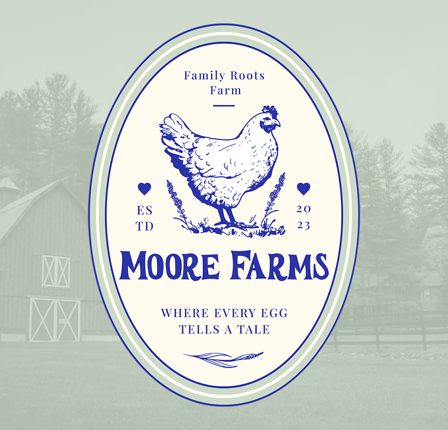
I developed this identity for Moore Farms as part of a vintage inspired branding system focused on simplicity, tradition, and small scale agricultural appeal. The goal was to create a mark that feels rooted in heritage while remaining clean and versatile enough for modern packaging, apparel, signage, and farm market applications.
The design centers around a classic oval label structure, drawing inspiration from old farm stamps, dairy packaging, and hand marked produce crates commonly associated with family owned farms throughout the Northeast. The illustrated chicken became the focal point of the identity, supported by restrained typography and minimal ornamental details to keep the overall presentation balanced and approachable. The limited color palette and simple line work were intentionally chosen to reproduce cleanly across a wide range of applications, from egg cartons and labels to embroidered merchandise and printed signage.
Typography played an important role in the overall tone of the piece. The serif lettering helps reinforce the traditional agricultural feel while maintaining enough structure and readability for contemporary use. Spacing, proportions, and layout were all designed to hold up consistently at different scales and production methods.
This project is a good example of building a brand identity around atmosphere and storytelling, creating something that feels timeless, grounded, and connected to the personality of the business itself.