I worked with the Greenville High School hockey team to design a complete visual package around their state championship run, including a custom uniform, championship logo, and supporting graphics.
The goal was to create something that felt earned; clean, bold, and timeless; while still capturing the energy of a championship moment.
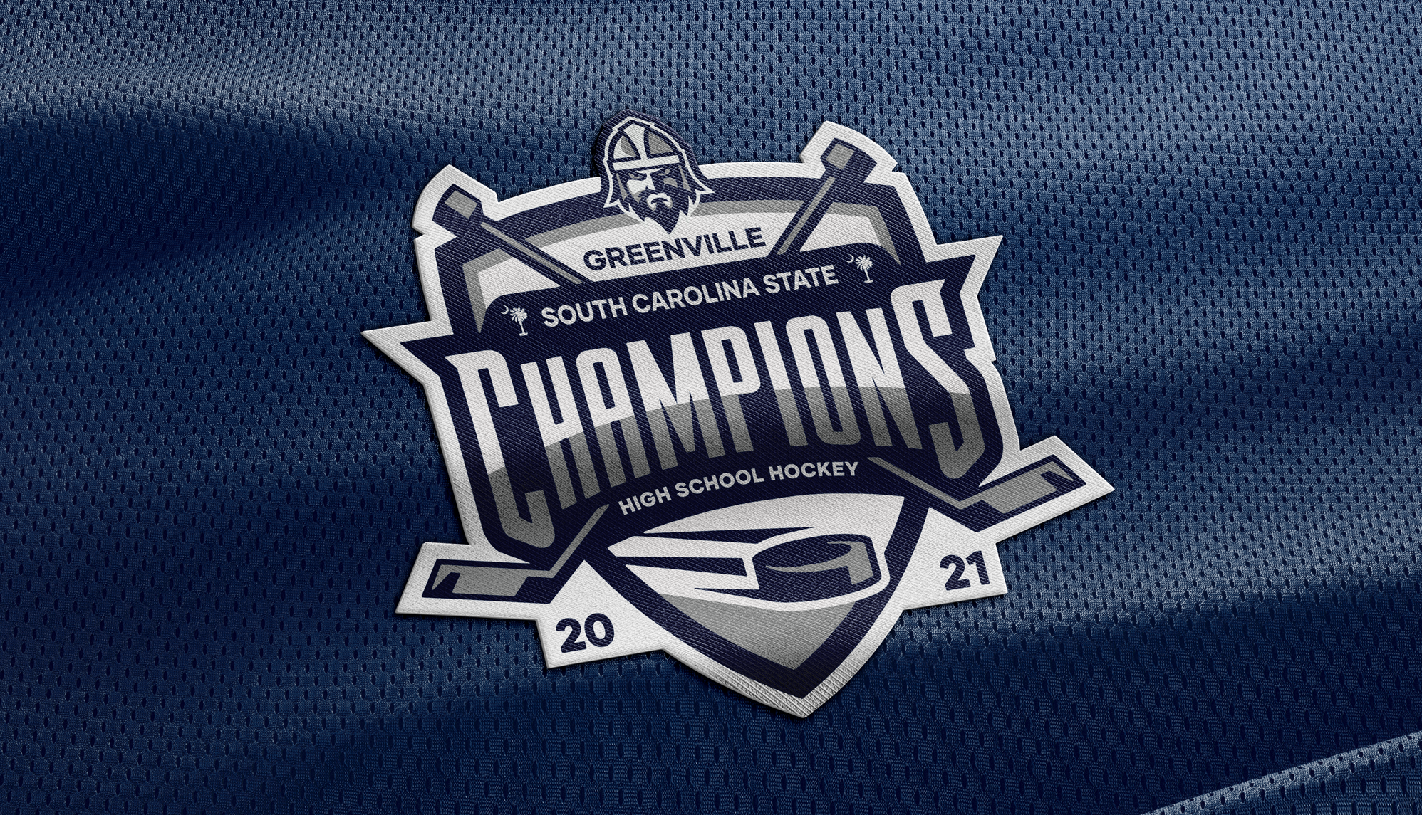
The centerpiece of the project is the state championship logo, designed to feel substantial and commemorative rather than overly flashy.
The mark combines traditional hockey elements; sticks, puck, and shield structure; with clear typography and a strong hierarchy. The result is something that works equally well as a patch, a print graphic, or a standalone mark for banners and digital use.
The uniform was built around a classic hockey aesthetic, using a navy, grey, and white palette with balanced striping and a clean script wordmark.
Everything was designed with production in mind, from number legibility to placement and spacing, so the final product would translate cleanly on the ice. The goal was a jersey that feels timeless rather than trend-driven.
The championship branding was extended into banners and apparel, creating a consistent look across different formats.
Whether it’s printed, worn, or displayed, the system holds together, giving the team a unified visual identity to represent the season.
Seeing the uniforms and graphics in use with the team was a big part of the project. Everything was designed to hold up in real conditions, from gameplay to printing, making sure the final result matched the original intent.
This project is a good example of combining identity, uniform design, and production awareness to create something that not only looks strong, but means something to the people wearing it.