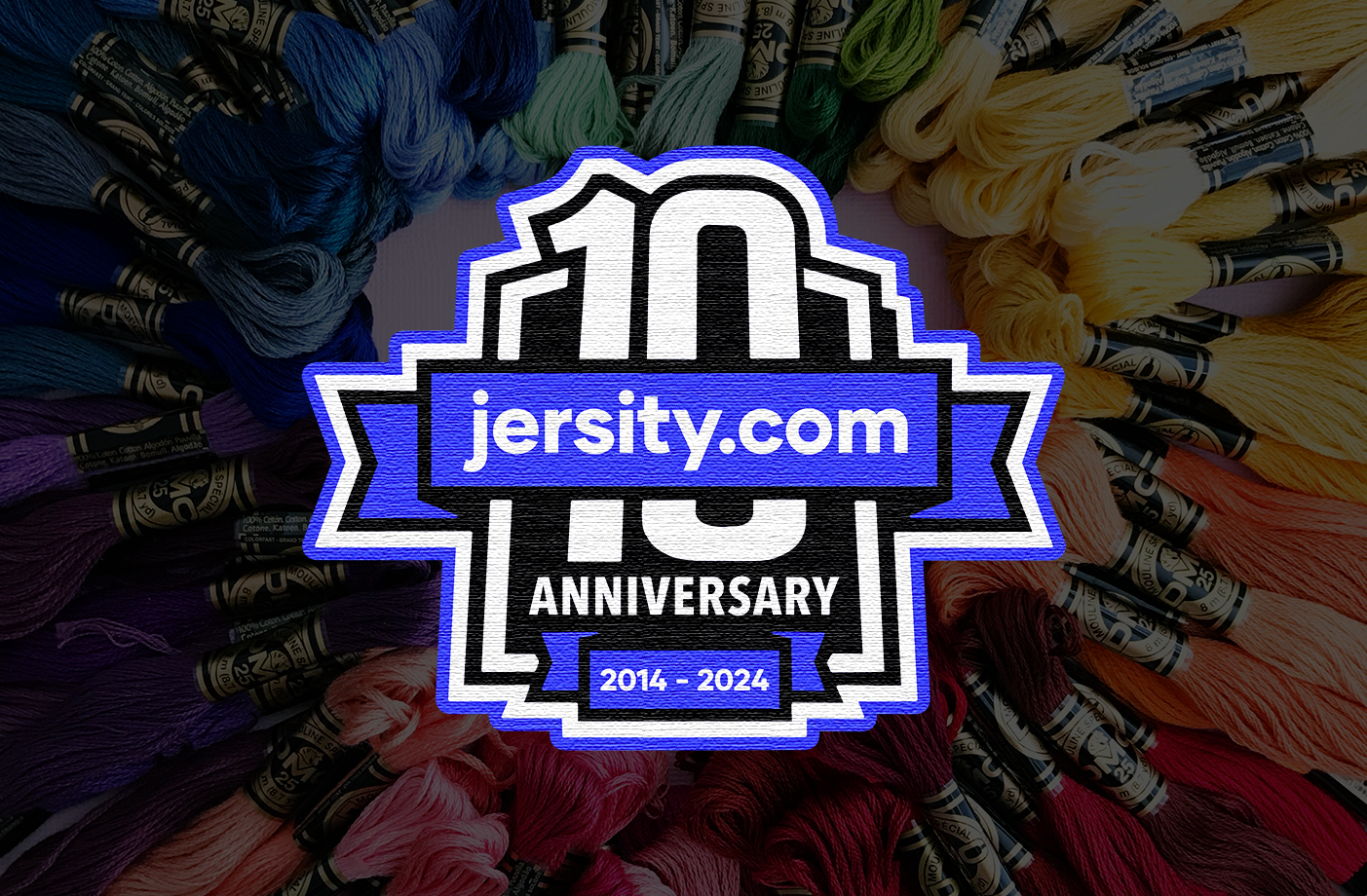
I created this anniversary logo to celebrate 10 years of Jersity Sportswear, marking a milestone for a company built around custom apparel and production.
The goal was to design something that felt commemorative without drifting too far from the brand’s core identity, something that could stand on its own, but still feel like a natural extension of the existing system.
The mark is built around a structured, badge style layout, giving it a strong, contained shape that works well across different applications.
The “10” is treated as the focal point, with supporting typography layered around it to clearly communicate the anniversary while maintaining a clean hierarchy. The use of bold outlines and contrast helps the mark hold up across both digital and physical formats.
Because the brand is rooted in apparel, the logo was designed with real-world application in mind from the start.
The shapes, line weights, and spacing are all built to translate cleanly into embroidery, print, and patches, ensuring the mark works just as well on a garment as it does on screen.
The badge format allows the logo to be used across a wide range of materials, from website graphics and social content to physical products and promotional items.
It’s designed to feel substantial and celebratory, while still being practical enough for everyday use.
This project is a good example of creating a milestone mark that not only celebrates a moment, but fits seamlessly into an existing brand system.