I created this illustration and identity piece for a podcast built around conversation, storytelling, and a slightly offbeat sense of humor.
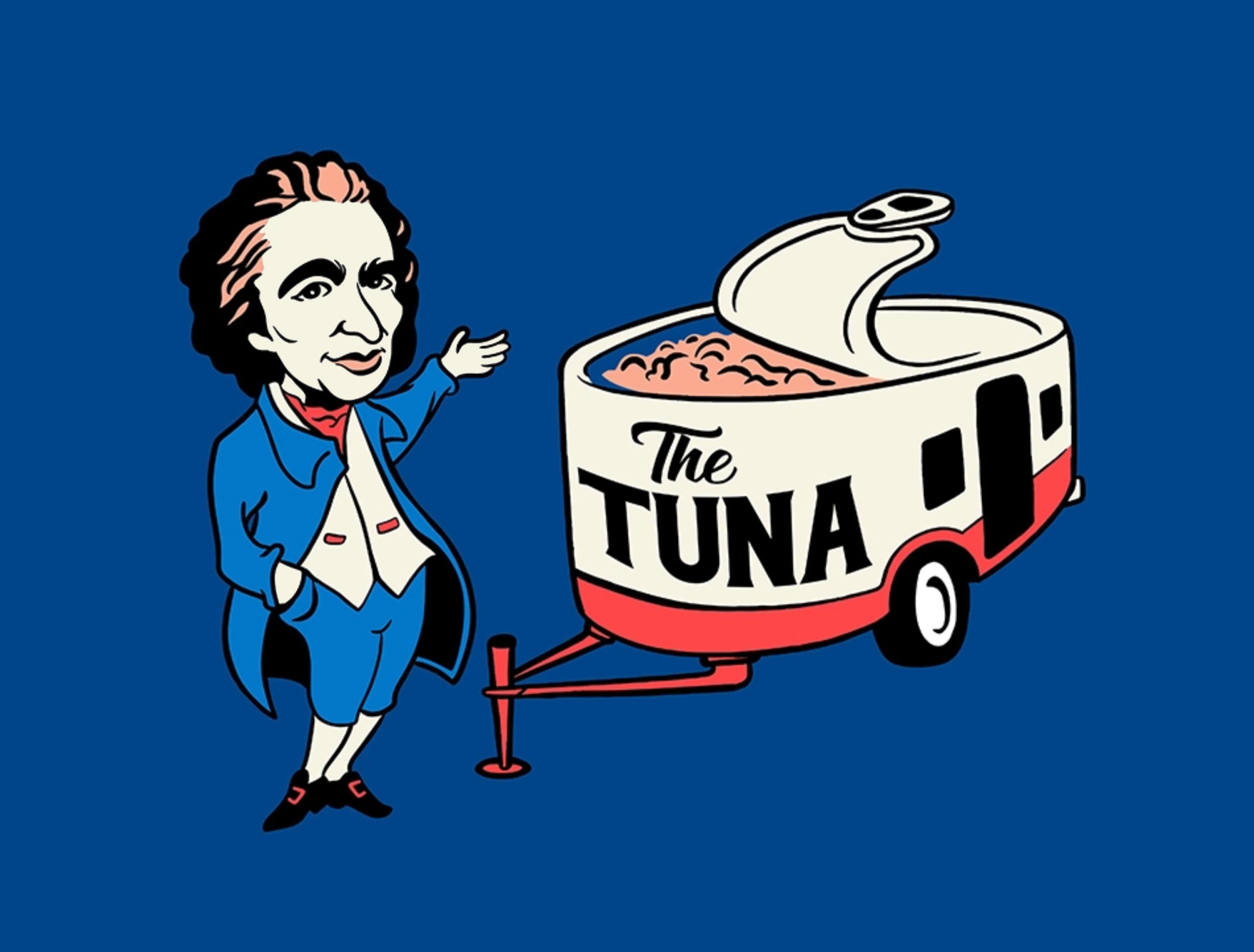
The concept centers on a stylized version of Thomas Paine paired with a custom-built “Tuna” trailer, an unexpected visual inspired by a real, slightly chaotic story behind the name.
The goal was to create something that felt playful, recognizable, and a little unconventional.
Rather than leaning too serious, the design embraces a more character-driven approach, using humor and visual contrast to give the podcast a distinct personality.
The illustration uses simplified shapes, bold outlines, and a limited color palette to keep everything clean and graphic.
Both the character and the trailer are designed to be easily readable and adaptable, whether used as a standalone graphic or part of a larger brand system.
The combination of character and icon creates a flexible identity that can evolve over time, working across episode graphics, social content, and merchandise.
It’s built to feel memorable first, with just enough detail to invite curiosity without over-explaining the concept.
This project is a good example of building personality into a brand, creating something that feels distinct, approachable, and open-ended.