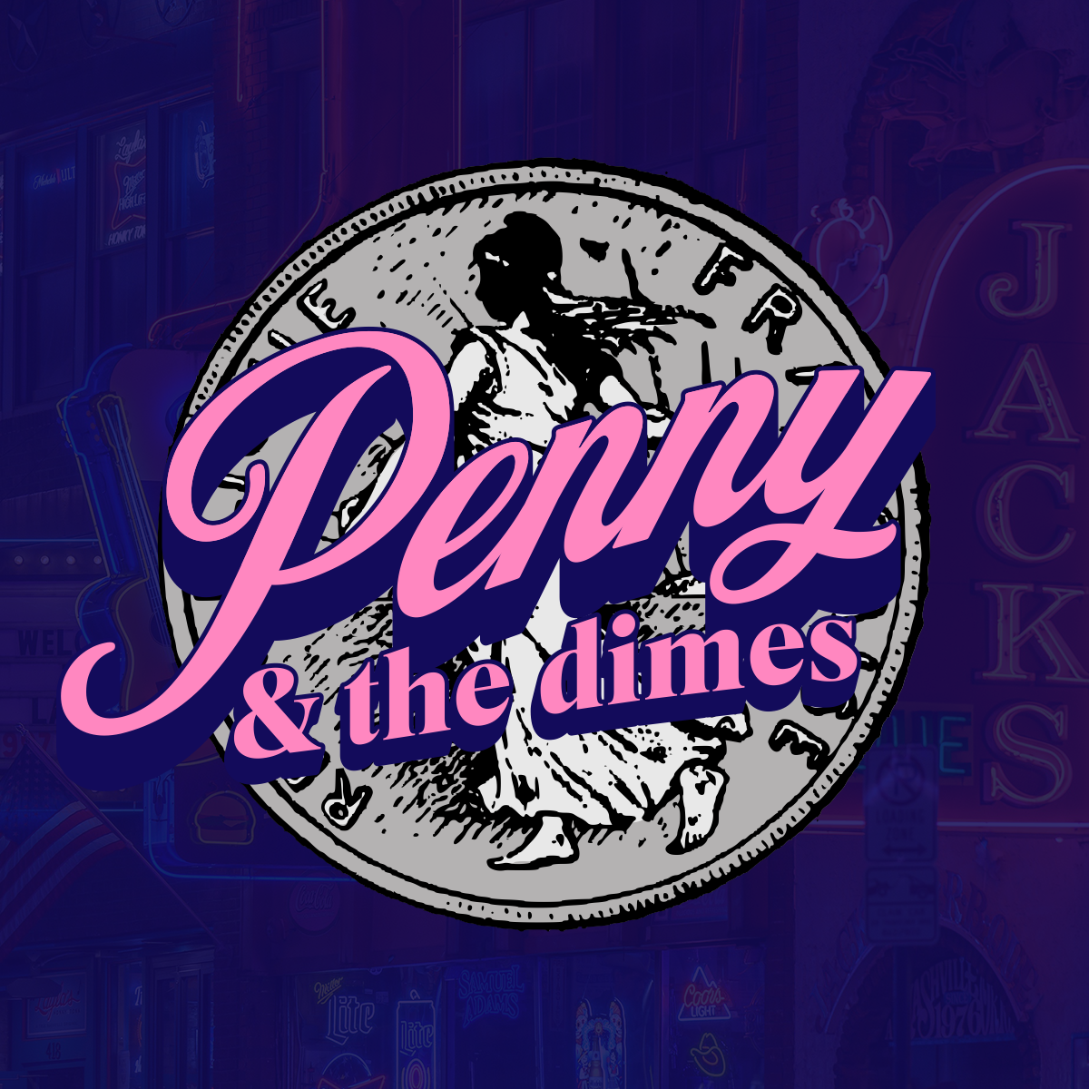
This is a concept logo for a band called Penny & The Dimes, built around a vintage inspired visual direction.
The goal was to create something that feels rooted in classic soul and rhythm-driven music, while still reading clearly in a modern context.
The identity is centered around the use of a coin as the primary visual element, tying directly into the band’s name while giving the mark a built in sense of character and history.
The combination of the illustrated coin and flowing script typography creates a contrast between structure and movement, something that reflects both the musical style and the personality of the name.
The script wordmark is designed to feel expressive and musical, with a strong sense of rhythm and flow.
Bold outlines and layered color help the mark stand out against the more detailed background, keeping it readable while still allowing the texture and illustration to come through.
The overall look pulls from vintage signage, classic record era graphics, and worn in textures, giving the identity a slightly nostalgic feel without becoming overly stylized or difficult to use.
This concept explores how a simple idea can be pushed into a full identity, combining typography and illustration to create something memorable and rooted in tone.