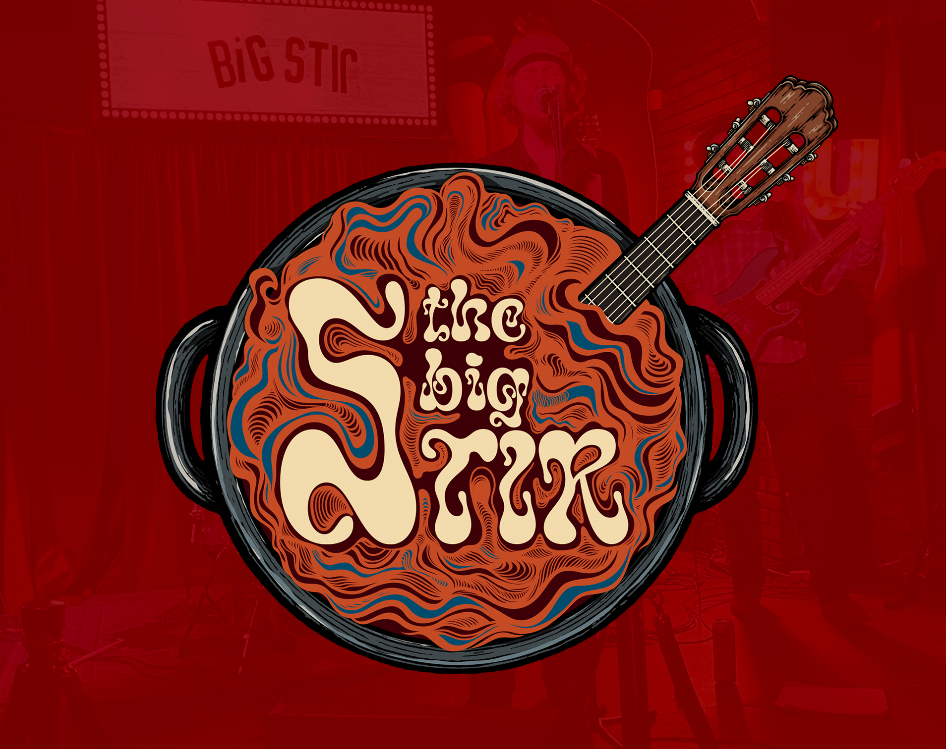
I created a series of promotional posters for The Big Stir, a blues-driven band, with a focus on building a consistent visual identity across multiple shows and venues.
The goal was to develop a style that felt rooted in the character of blues and rock; something raw, textured, and expressive; while still keeping the information clear and easy to read.
Each poster leans into bold typography, high contrast, and layered textures to create a sense of energy and movement.
Rather than relying on a single template, I approached each piece individually, using different type styles, color palettes, and compositions while maintaining an overall consistency in tone. The result is a series that feels connected, but not repetitive.
Typography plays a central role throughout the series. Large, expressive type is used to establish hierarchy and draw attention, while secondary information; dates, venues, and supporting acts; is kept clean and structured for readability.
The layouts are intentionally straightforward, making sure the core details are immediately clear while still allowing the visuals to carry personality.
The designs pull from classic concert posters, vintage print textures, and hand-drawn elements, giving the series a slightly worn in, analog feel.
That approach helps match the tone of the music itself, something that feels lived in rather than overly polished.
Even as the visuals shift from poster to poster, the series holds together through consistent use of contrast, texture, and typographic weight. This creates a recognizable look that can evolve over time without losing its identity.
This series is a good example of balancing consistency and variation, building a visual style that can adapt from show to show while still feeling like part of the same world.