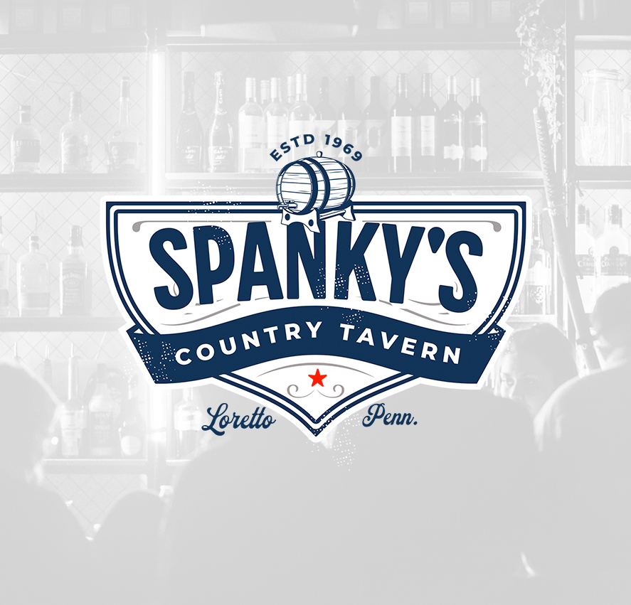
I developed this identity concept for Spanky’s Country Tavern; a small town Pennsylvania bar; with a focus on creating something that felt rooted in traditional American tavern branding while still functioning cleanly across modern applications.
The goal was to build a mark that felt established and familiar, drawing from classic roadside bars, whiskey labels, and vintage hospitality signage without leaning too heavily into nostalgia. The structure combines bold typography with layered borders, ornamental details, and distressed texture work to create a logo that feels worn in rather than over designed.
The central banner structure helps organize the information clearly, while the barrel illustration and custom framing elements reinforce the tavern atmosphere without overpowering the typography. The color palette was intentionally restrained, using deep navy, off white, and muted accent tones to create something timeless and easy to reproduce across print and production methods.
Much of the work focused on balancing detail with usability. The textures and decorative elements add character, but the overall composition remains clean and structured enough to translate well across embroidery, screen printing, vinyl signage, and digital use.