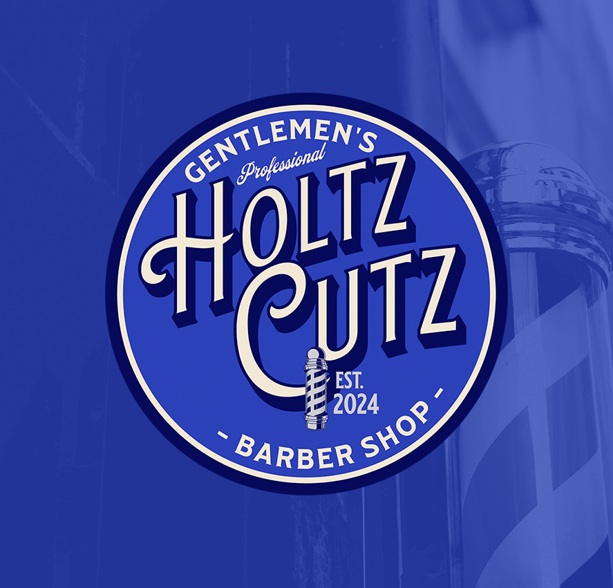
I designed this concept identity for Holtz Cutz, a barbershop brand built around classic signage, bold typography, and a clean, timeless presentation.
The goal was to create a mark that feels established and recognizable from the start, drawing inspiration from traditional barbershop branding while keeping the overall execution sharp and modern. The circular badge structure gives the logo a strong foundation, allowing it to work across storefront applications, apparel, merchandise, and digital use without losing clarity.
Typography became the centerpiece of the identity. The custom styled lettering was designed to feel confident and professional, with enough personality to stand on its own while still remaining highly readable at different scales. Supporting elements, including the barber pole icon and surrounding layout, were kept simple and intentional to reinforce the classic influence without overcomplicating the mark. Color selection also played a major role in the overall direction. The bold blue and cream palette references vintage barbershop aesthetics while giving the brand a clean, contemporary feel that works well across print and apparel applications.
This project focused on creating a versatile identity system rooted in classic visual language, something professional, durable, and built to represent the business clearly across a wide range of applications.