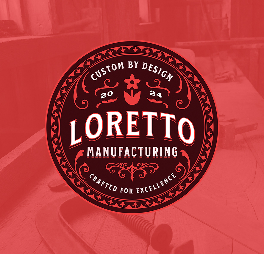
I created this identity for Loretto Manufacturing, a woodworking and craftsman focused brand built around traditional production values and vintage industrial styling.
The goal of the project was to develop a mark that felt established and timeless from the start, something that could live comfortably across signage, apparel, packaging, stamps, labels, and workshop branding without relying on trends or overly modern styling.
The identity draws heavily from old manufacturing seals, hand painted shop graphics, and heritage trade labels. Ornamental flourishes, layered borders, and bold serif typography were combined to create a mark that feels rooted in craftsmanship while still remaining clean and readable in modern applications. The circular badge format allows the design to scale naturally across a wide range of uses, from embroidered patches and hats to laser engraving, printed labels, and social branding.
The typography was designed to carry most of the visual weight, while the supporting decorative elements help reinforce the handcrafted and production oriented direction of the brand. The deep red palette and layered shadows were chosen to give the mark warmth, depth, and a slightly aged industrial feel without appearing distressed or artificial.
Like many of my apparel and badge style projects, this identity was created with production in mind first. Balancing detail and personality while ensuring the logo remains durable, legible, and functional across real-world applications.