I worked with the Pacific Northwest Youth Hockey League to develop the primary identity for a new organization preparing for its inaugural 2027–2028 season.
The goal was to create a mark that reflects both the region and the long-term vision of the league, something strong, recognizable, and built to grow over time.
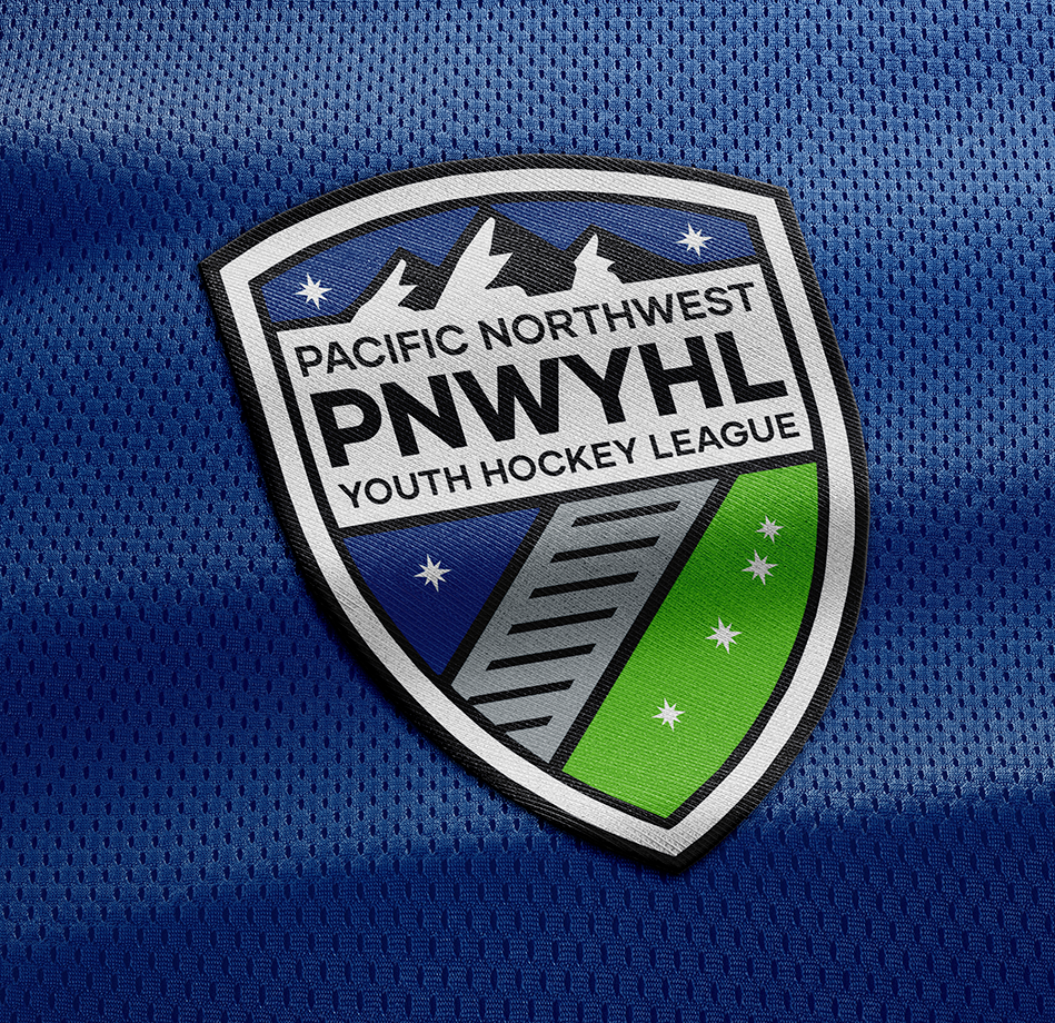
The identity is built around a shield structure, combining elements inspired by the Pacific Northwest landscape with a clean, modern layout.
The mark balances bold shapes with clear typography, allowing it to translate easily across uniforms, apparel, and digital platforms. The intent was to create something that feels established from day one, while remaining flexible as the league expands.
From the start, the logo was designed with real world use in mind, particularly how it would function on jerseys and across a range of production methods.
The structure, spacing, and line weights were all built to hold up at different sizes and applications, ensuring consistency across teams and environments.
Because the league is in its early stages, the identity needed to act as a foundation for everything that follows.
The goal was to create something that not only represents the league today, but can scale with it, supporting multiple teams, seasons, and future expansion while maintaining a cohesive look.
This project is a good example of building a primary identity for an organization at its starting point, creating something designed to grow, adapt, and hold up over time.