
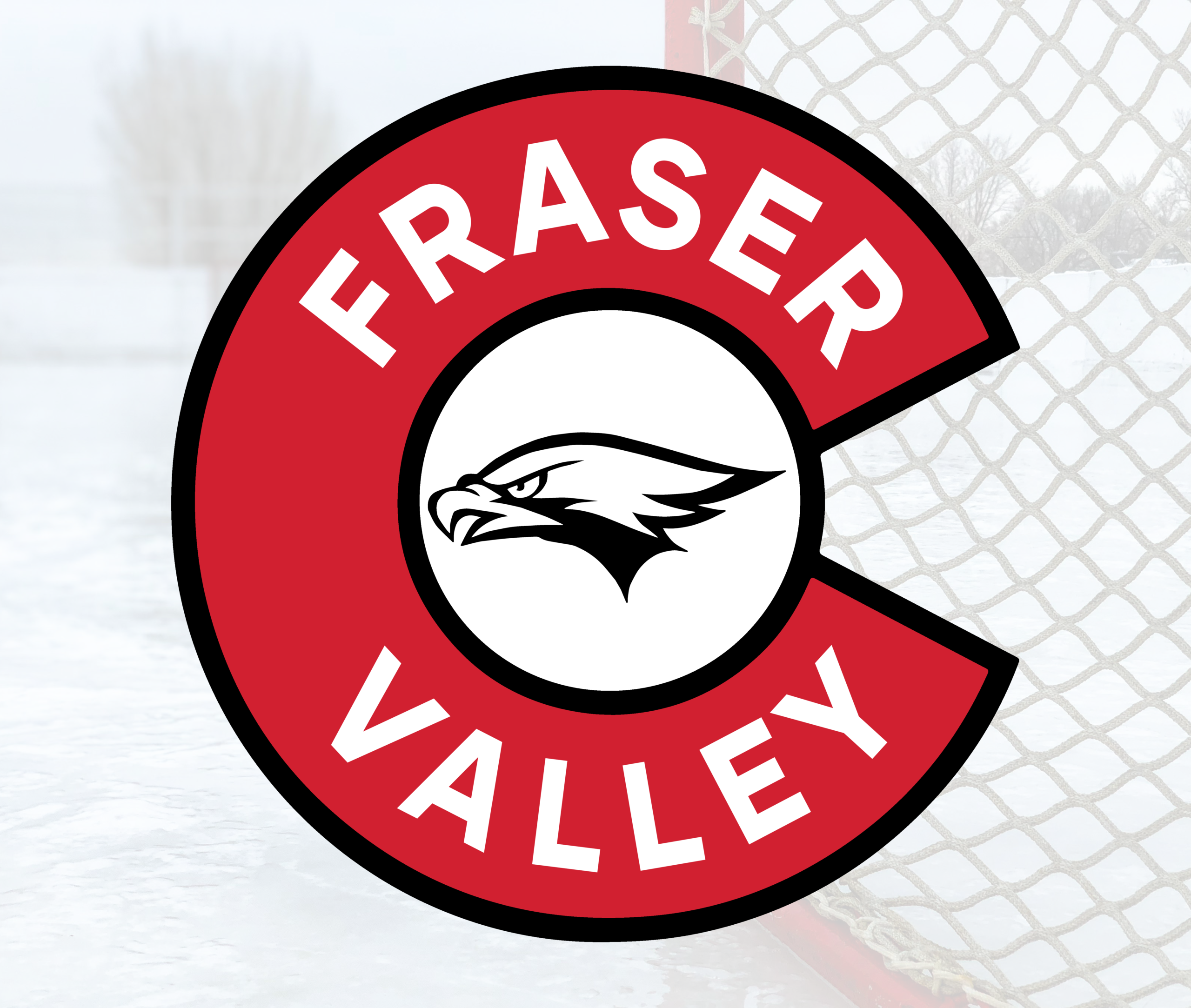
I designed this identity for a youth hockey team based in Colorado, built around a bold, recognizable “C” mark that anchors the entire system.
The goal was to create something simple, strong, and immediately readable, an identity that works just as well at a distance on the ice as it does across apparel and supporting graphics.
The primary mark is centered around a large “C,” tying directly to the team’s regional identity while creating a clear, iconic silhouette.
Inside the mark, the eagle head adds character and energy without overcomplicating the design. The combination keeps the logo versatile and easy to reproduce across different formats, from jerseys to print to digital use.
From the logo, I developed a full series of jersey concepts exploring different colorways and striping variations.
Each design keeps a consistent structure while shifting the balance of color and contrast, allowing the team to have multiple looks without losing its identity. The goal was to create options that feel cohesive as a set, rather than unrelated designs.
All concepts were built with real world production in mind, clean shapes, strong contrast, and clear separation of elements to ensure the designs translate well across printing and manufacturing.
The logo and striping systems are designed to hold up at different sizes and materials, from full uniforms to smaller applications.
This project is a good example of building a simple, flexible identity and extending it into a full uniform system that can evolve without losing its core.