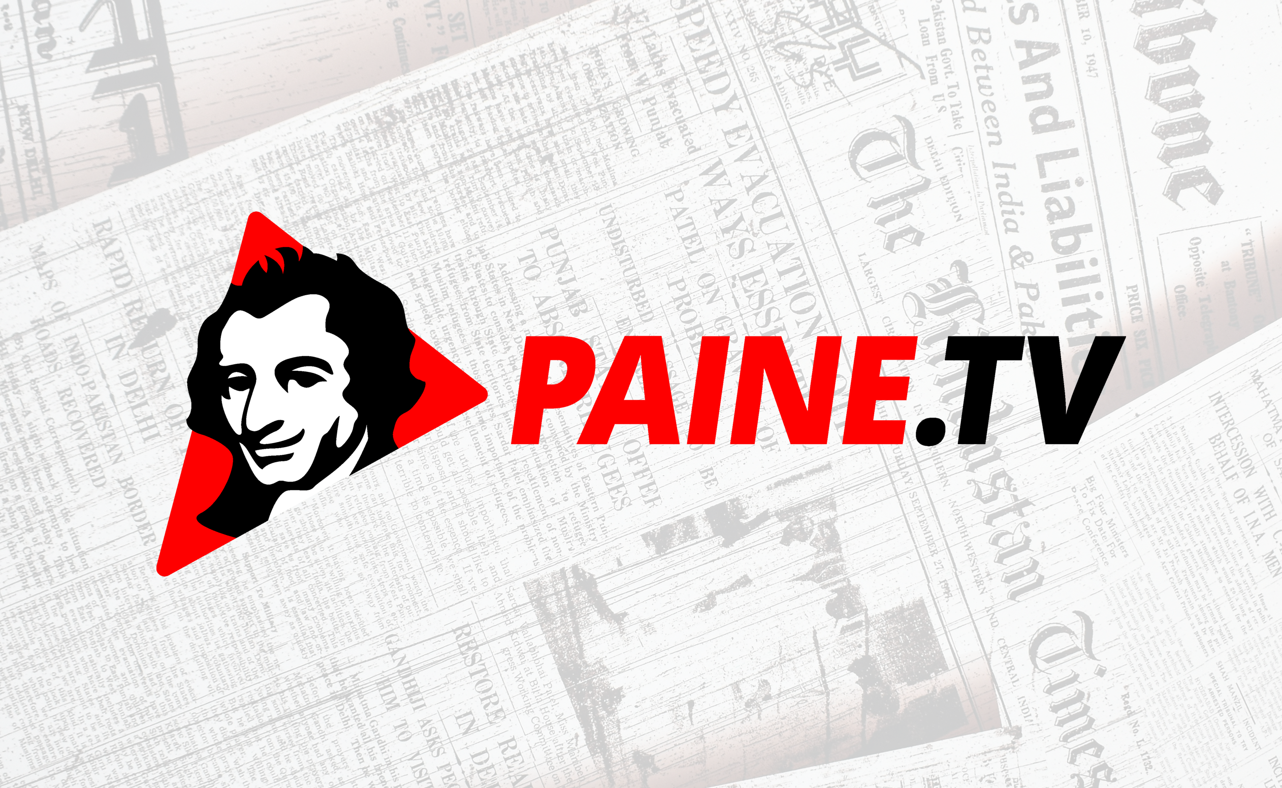
I created this logo for Paine.TV, an online news and community platform built around independent thought, commentary, and discussion.
The goal was to develop an identity that felt bold, recognizable, and rooted in historical influence, while still working in a modern digital context.
The mark is centered around Thomas Paine, using a simplified, graphic interpretation of his likeness as the foundation of the identity.
Paine’s legacy; independent thinking, strong opinions, and direct communication; served as the conceptual backbone for the design. The goal was to capture that spirit in a way that feels current and accessible, rather than overly traditional or historical.
The design uses strong contrast, minimal shapes, and a limited color palette to keep the mark bold and immediately recognizable.
The red elements introduce energy and urgency, while the black and white foundation keeps everything grounded and versatile. The angular shapes and directional elements help reinforce the idea of forward movement and conversation.
The wordmark is clean, direct, and easy to read, designed to pair naturally with the icon without competing for attention.
The combination of icon and type allows the brand to function flexibly, whether used as a full lockup, a standalone mark, or adapted for digital formats like thumbnails, headers, and social content.
The identity is built to work primarily in a digital environment, where clarity and recognition at small sizes are critical.
At the same time, the simplicity of the mark allows it to translate easily across different formats, from web to print to merchandise.
This project is a good example of building a modern identity around a historical reference, creating something that feels rooted in meaning, but designed for how it’s used today.