
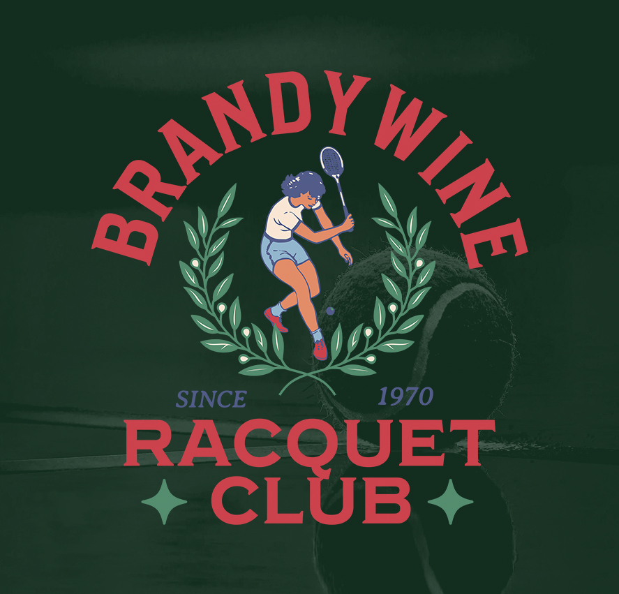
This concept design was developed for the Brandywine Racquet Club, a long running tennis organization with roots dating back to 1970.
The goal of the project was to create an apparel focused graphic that felt connected to the club’s history while introducing a more relaxed, lifestyle oriented visual direction. Rather than leaning into traditional country club branding, the design takes inspiration from vintage athletic graphics and classic tennis merchandise, combining softer colors, illustrated elements, and a more casual composition.
At the center of the design is an illustrated tennis player framed by symmetrical laurel elements, referencing competition and longevity without feeling overly formal. The typography was structured to create a strong vintage crest feel, while the overall palette keeps the piece approachable and wearable across apparel applications.
From the beginning, the artwork was designed specifically with production in mind. The illustration style, color count, and layout were all developed to translate cleanly across screen printing, embroidery, and merchandise graphics while maintaining clarity at different sizes.
The project was intended to feel less like a corporate logo system and more like a timeless piece of club merchandise, something members would actually want to wear beyond the courts. This piece is a good example of balancing heritage and personality within an apparel driven identity system, using illustration and typography together to create something rooted in tradition while still feeling modern and versatile.