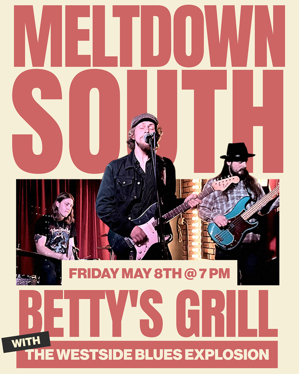
I designed this poster for Meltdown South to promote a live performance at Betty’s Grill in Nashville, using a layout built around bold typography and straightforward visual impact.
The design takes influence from classic concert posters and local venue flyers, relying on oversized type, limited color palettes, and strong hierarchy to make the information immediately readable both online and in print. From the start, the goal was to create something that felt energetic and raw without becoming overly complicated.
The typography acts as the primary visual element, framing the photography while reinforcing the tone of the band and venue. Large condensed lettering creates a strong vertical structure, while the muted cream and red palette gives the piece a slightly vintage feel inspired by older blues and rock promotional materials. The photography was intentionally integrated directly into the typography layout rather than treated as a separate element. This allowed the band imagery to feel embedded into the overall composition instead of sitting independently on the page.
Because music posters often need to work quickly in crowded environments and across social media feeds, clarity and balance were important throughout the process. Spacing, contrast, and scale were adjusted to ensure the key information remains readable at multiple sizes and formats.