I designed this anniversary mark for the Michigan Stingrays to celebrate the team’s 20th season.
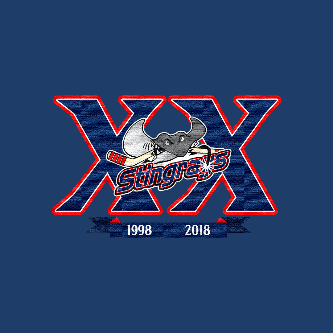
The goal was to create a bold, celebratory mark that felt consistent with traditional hockey anniversary branding, while still capturing the personality of the Stingrays.
The structure centers around a classic “XX” format, providing a strong, recognizable foundation for the design.
The Stingrays wordmark is layered across the center, paired with a custom illustrated stingray gripping a hockey stick, adding energy and character to the composition.
The red, white, and blue palette reinforces a strong, high contrast look that reads clearly across both digital and physical applications.
A subtle starburst detail on the lettering introduces a celebratory element without overwhelming the design.
The years are anchored beneath the mark in a clean ribbon element, completing the anniversary format while maintaining balance within the composition.
All elements were designed to remain legible and impactful across a range of uses, from jerseys to promotional graphics.
This project reflects a classic approach to hockey anniversary branding, combining structure, energy, and team identity into a single mark.